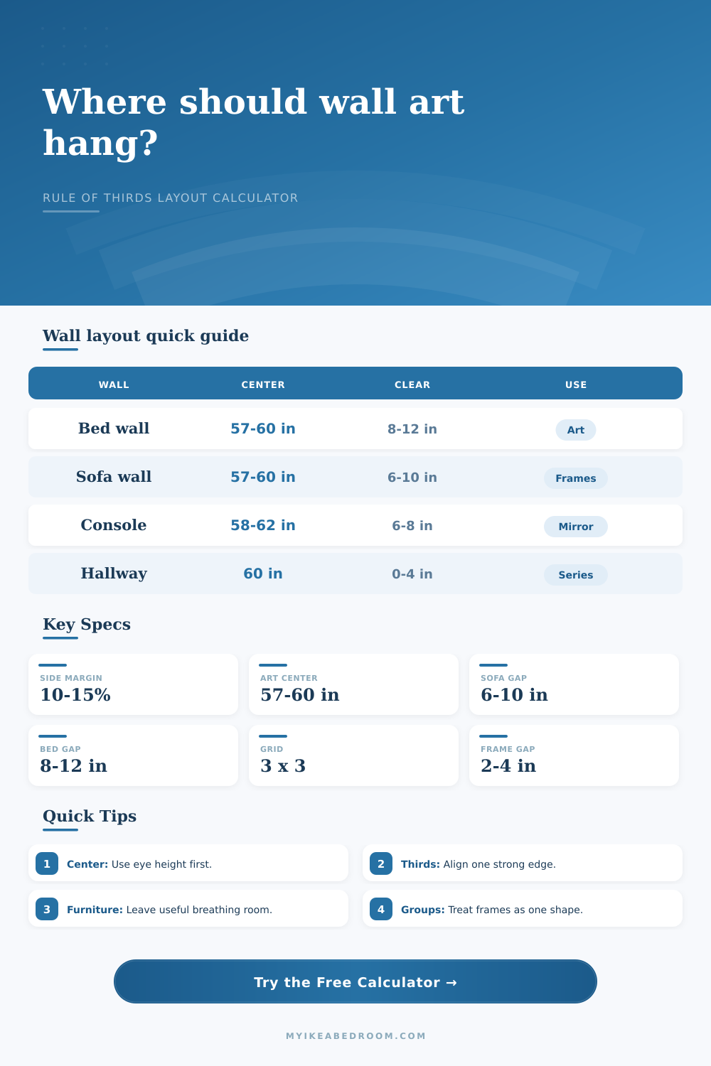
Rule of Thirds Wall Layout Calculator
Find vertical and horizontal third-line coordinates, then size and hang art, mirrors, shelves, or frame groupings around a wall, furniture anchor, eye height, and safe margins.
1Wall layout presets
Start with a real wall arrangement, then adjust the wall, focal piece, furniture, margins, grid, and frame grouping.
2Calculator inputs
Calculated wall placement
3Layout reference cards
4Reference tables
| Wall size | Left vertical third | Right vertical third | Horizontal thirds from floor |
|---|---|---|---|
| 8 ft x 8 ft | 32 in / 81 cm | 64 in / 163 cm | 32 in and 64 in |
| 10 ft x 8 ft | 40 in / 102 cm | 80 in / 203 cm | 32 in and 64 in |
| 12 ft x 8 ft | 48 in / 122 cm | 96 in / 244 cm | 32 in and 64 in |
| 14 ft x 9 ft | 56 in / 142 cm | 112 in / 284 cm | 36 in and 72 in |
| 16 ft x 9 ft | 64 in / 163 cm | 128 in / 325 cm | 36 in and 72 in |
| Wall condition | Center height | Bottom clearance | Best alignment |
|---|---|---|---|
| Open standing wall | 57-60 in | Safe bottom margin | Center or third line |
| Above bed headboard | 60-66 in often | 8-12 in above top | Furniture center |
| Above sofa back | 58-64 in often | 6-10 in above top | Furniture center |
| Above dresser | 60-68 in often | 6-8 in above top | Mirror center |
| Seated reading nook | 48-54 in | Based on chair back | Nearest third |
| Grouping | Frame size | Gap | Overall span |
|---|---|---|---|
| Two side by side | 16 x 20 in | 3 in | 35 x 20 in |
| Three in a row | 18 x 24 in | 3 in | 60 x 24 in |
| Four grid | 16 x 20 in | 2 in | 34 x 42 in |
| Six gallery grid | 12 x 16 in | 3 in | 42 x 35 in |
| Nine square grid | 12 x 12 in | 2 in | 40 x 40 in |
| Feature near layout | Side buffer | Top buffer | Reason to allow space |
|---|---|---|---|
| Inside wall corner | 6-12 in | 0-6 in | Keeps edge from feeling pinned |
| Door casing | 8-12 in | 0-6 in | Avoids swing and trim crowding |
| Curtain stack | 10-18 in | 4-8 in | Leaves fabric movement room |
| Picture light | 4-8 in | 8-14 in | Allows fixture and beam spread |
| Switch or outlet | 3-6 in | 3-6 in | Keeps controls accessible |
5Placement tip boxes
Most folks hang their artwork at eye level. But that’s usually too low! Eye-level for standing grownups isn’t always in the middle of room because it changes. So what happens? Your art becomes too low, sitting too near bed or sofa. It looks too much like a shelf instead of a statement.
The Rule of Thirds solves this dilemma. This is a method that artists and photographers borrow from one another. It divide your picture (or wall) into 9 squares. Where do our eyes naturaly rest? At the intersections of the lines & squares. When you place your focal points on those lines, it balances out your composition without making it look stiff like dead-center symmetry does.
How to Hang Art Perfectly Using Math
But what about all that geometry? What about pulling out a tape measure and doing some mental math? Enter this calculator. It do the geometry work for you. Simply put in dimensions of mirror or other frame. Then, add the size of furniture underneath and width of wall. And there you go! It will plot the location of those third lines in actual inches or centimeters.
It also accounts for the furniture anchor. After all, art hung over a sofa should be at a different height then art hanging in an otherwise empty hall. The distance from bottom of frame to top of sofa is a place many people goes wrong. Either they leave too much space, making artwork appear disconnected. Or too little, which can make the setup seem cramped. That sweet spot is typically between six and ten inches, depending on how large artwork is. The calculator shows you way there.
This is where it starts to get interesting if you’re working with multiple frame. They might be on one big wall like in a gallery wall, but now we can’t put each frame by itself. Now we have to think about the group as a unit. So measure out the outside of all frames in your collection, plus any space between them. And then draw that entire collection onto the grid and line up composite form against the rule-of-thirds grid.
How many frames do you have? Set the gap size in the calculator and let it figure out how much space the whole thing will take up. It’ll spit out where the left/right edge of group should fall. This prevents common error of putting the frames spread too far apart, making what was supposed to be a small wall look crazy busy.
Where tool really shines is in the vertical alignment. For open walls, standard gallery practice aligns center of art with 57 to 60 inches from floor. On the other hand, if you’re dealing with a deep headboard or a high dresser, being strict with this number can looks odd. With the calculator, you can choose to make furniture clearance more important than being strict about eye height. You enter your desired gap, and it updates hanging height based off that. It’s just a little adjustment, but makes all the difference in how room feels.
You can also define your safe margins, keeping your art away from curtain stacks, light switches, or door casings. Nothing looks intentionally placed when there’s a frame touching edge of a door frame, no matter how perfectly centered everything else might be.
For example there is a pre set for things like a gallery wall over a sofa or a queen bed headboard. That helps as a starting point as it will load with some realistic defaults of what height and width should be. Not all rooms are conventional so you can adjust accordingly, but it’s a good starting point and gives you something to go from. You would of loved the options.
There are also reference tables on the page that show standard coordinate guides based off common wall sizes. Those is handy quick look up tools when you want to check output of calculator or plan ahead prior to measurement. There are coordinates and there are relationships, which is what composing is all about. The rule of thirds provides you with a framework, but ultimately the final image must be approved by your own eye.
Let the tool calculate the numbers, then stand back and ask yourself whether space feels breathable. Is it too tight on one side? Widen the margins. Does it feel lost inside the frame? Close up some gaps between elements. The calculator will give you precision. Your taste provides the rest. That’s the best way to eliminate guesswork that leads to a wall full of holes. Start with the grid, trust the math, then leave the final polish for your intuition. That’s how you turn a blank wall into a balanced design that looks easy but is actualy planned perfectly.