Room Aspect Ratio Calculator
Compare room length, width, ceiling height, focal wall width, largest furniture length, rug size, layout orientation, and a target proportion to judge visual balance.
Start with a common room shape, then adjust the measured dimensions and the target ratio for your layout.
Reading the proportions
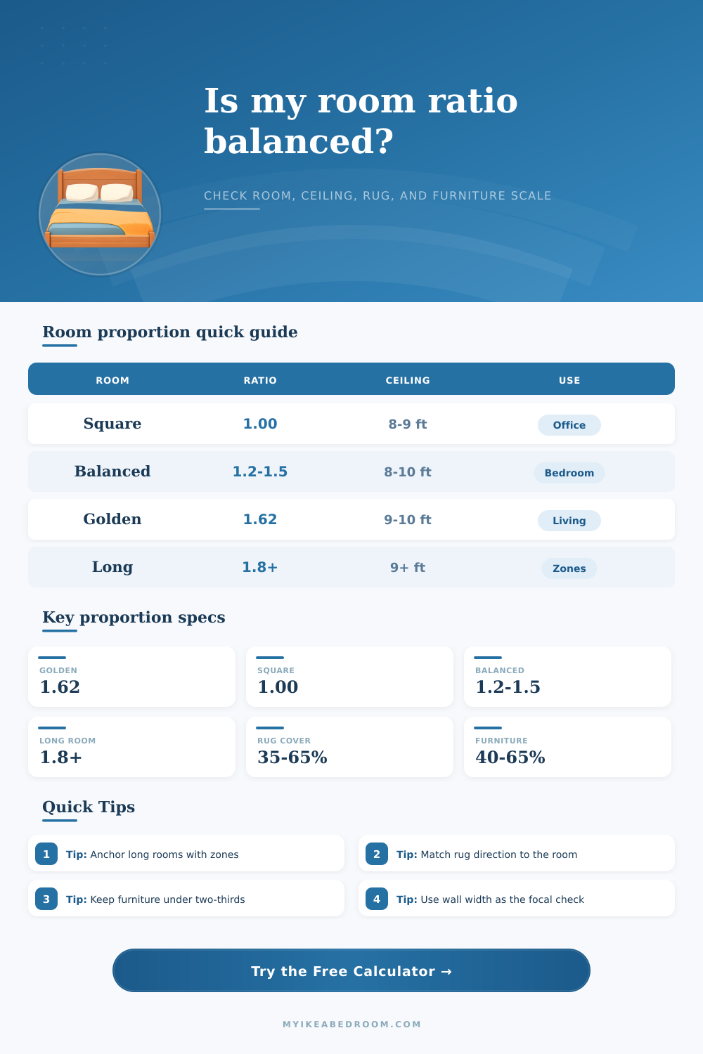
Room: A balanced rectangle usually lands between 1.20:1 and 1.60:1.
Ceiling: Height should feel proportional to the shorter room span.
Furniture: Anchor pieces usually feel best at 40% to 65% of the focal wall.
Rug: Coverage around 35% to 65% tends to define the room without swallowing it.
| Room ratio | Typical feel | Best layout orientation | What to watch |
|---|---|---|---|
| 1.00 to 1.10 | Square or nearly square | Centered island, diagonal, or symmetrical | Furniture can feel static if every piece hugs a wall. |
| 1.11 to 1.30 | Soft rectangle | Long-axis or centered | Keep focal wall wide enough for the main anchor. |
| 1.31 to 1.60 | Balanced rectangle | Long-axis with one clear focal wall | Match rug direction to the room direction. |
| 1.61 to 1.80 | Golden to elongated | Long-axis or zoned | A single rug may not define the whole room. |
| 1.81 and up | Long narrow room | Split zones or furniture across the width | A long sofa can make the room feel even narrower. |
| Ceiling check | Planning range | Visual reading | Adjustment cue |
|---|---|---|---|
| Ceiling / short wall below 0.55 | Low relative height | Room may feel compressed | Use lower furniture and strong horizontal lines. |
| 0.55 to 0.75 | Balanced range | Most bedrooms and living rooms feel natural | Standard rugs and wall anchors usually work. |
| 0.76 to 0.95 | Tall room range | Vertical space becomes a design factor | Use taller storage, art, or curtains to connect height. |
| Above 0.95 | Loft or narrow tall room | Height can overpower floor area | Layer lighting and tall focal elements carefully. |
| Furniture / focal wall | Scale feel | Works well for | Layout note |
|---|---|---|---|
| Under 35% | Small or under-scaled | Minimal desks, accent benches, small cribs | Add art, lamps, or storage to widen the focal composition. |
| 35% to 45% | Airy | Nursery, office, guest room | Good when the room needs open circulation. |
| 45% to 65% | Balanced | Beds, sofas, consoles, tables | Usually the strongest range for a calm anchor wall. |
| 65% to 80% | Dominant | Large sectional, king bed, media wall | Keep side clearances and rug alignment deliberate. |
| Over 80% | Wall-filling | Built-ins or very large furniture | Check door swings, windows, and visual breathing room. |
| Rug coverage | Room reading | Best use | Watch point |
|---|---|---|---|
| Under 25% | Accent rug | Desk nook, reading chair, nursery corner | May not connect the main furniture group. |
| 25% to 35% | Light anchor | Small bedroom, square office, entry zone | Keep front furniture legs on the rug when possible. |
| 35% to 65% | Balanced coverage | Most bedrooms and living rooms | Check equal border exposure on the visible sides. |
| 65% to 80% | Large carpet effect | Open room zone or generous bedroom | Leave enough exposed floor at walls and doors. |
| Over 80% | Nearly wall to wall | Rare for loose rugs | Edges can look accidental unless fitted carefully. |
Use the ratio as a layout clue, not a rule. A long room can score well when the rug, furniture, and focal wall intentionally break the length into zones.
Check scale before styling details. If the largest furniture piece is too small for the focal wall, pillows, lamps, and art will not fully solve the imbalance.
You know when you’ve been in a room with nothing in it? You stand there and just…something’s not right. Maybe it’s way too high or maybe it feels cramped, even though it has a lot of square footage. Very seldom does that have anything to do with raw dimensions. That very nearly always has to do with proportion. Proportion is the relationship between height, width, and length. And your eyes take that image in before you ever get around to considering paint colors.
Once you put in those numbers on this calculator, it does the math for you. This means that instead of guessing if your layout is going to work, you won’t end up purchasing all those lamp.
How to Check Room Proportions
The first thing to check when evaluating a floor plan is its length-to-width ratio. If the ratio equals 1.00, it’s a perfect square that feel enclosed and steady. It is good for playrooms or offices where you want movement to be centered. But in most living spaces, we’d prefer something with more stretch. Try ratios ranging from 1.2-1.5 (a soft rectangle) as these will feel balanced without being too narrow. Many designers seek the so-called golden ratio (about 1.62), which has pleased the human eye for centuries. It offers just-enough elongation to direct movement around space, yet still leaves walls substantial enough to support a media unit or art. Once you go beyond 1.8, you are looking at a long, narrow shape that requires thoughtful zoning to prevent it from feeling like a hallway.
Those floor measurements read different depending on the ceiling height. A room that’s perfectly 12 by 14 will be cozy and grounded if the ceiling is only eight feet. Raise the ceiling to ten feet, and now space suddenly seems airy and formal. To help check for that kind of vertical balance, the tool lets you compare the height to the shorter wall span. That’s important because wide rooms with low ceilings can feel oppressive when your eyes aren’t tricked into breaking up the walls with horizontal lines. In small rooms with high ceilings, you don’t need tall storage or big rugs to anchor furniture; without them, everything in the room will look like toy furnitures. It’s as much about the air above as it is about amount of floor.
Furniture scale stops most people in their tracks. You’re lured by a great looking sofa on the sales floor… It appears just right for the wall! Then you bring it home and realize it either vanishes into the wall or dominates it entirely. The calculator compares your biggest piece to the width of your focal wall. As a general rule of thumb, your primary anchor piece should use up somewhere between 40. 65 percent of that wall. Less than 35% makes for way too much open space, that’s going to call even more attention to what’s absent. More than 80% will feel cramped and suffocating. Don’t attempt to correct this issue with accessories alone if your sofa or bed is relatively small compared to the wall. You’ll need something bigger (like a substantial headboard, wide console, layered art) to help visually fill in the gap.
Rugs define the space within the larger area. Typically, the most contained feeling happens when there’s a rug that fills anywhere from 35, 65 percent of the floor. Less than this and the rug feels like an island in a sea of floor. More and you’ll end up with a rug that gobbles up any architectural features at the wall. As much as possible, the direction of the rug should align with the direction of the room. So if the room has lots of length to it, then having a rug that runs with the length would reinforce the direction of the room. If the room is square, having the rug centered will highlight the symmetrical nature of the room.
These aren’t hard fast rules, just good starting places to help keep the visual less cluttered. The ratio helps your eye flow around the room. If it works, you won’t be aware of the walls anymore, just loving the room. Think of them more like hints rather than rules. Go with what feels good to you, even if it does not fit one of the coefficients. You should of checked this first!