Photo Wall Grid Layout Calculator
Plan a clean frame grid from wall size, frame size, rows, columns, spacing, top margin, and eye-line height, then check total grid size, spacing fit, margin balance, centerline height, frame count, and layout score.
Choose a familiar wall type, then adjust the measured dimensions and frame format for your actual layout.
Thin metal frame
Best gap: 2 to 3.5 in.
Clean edges make tight, precise grids read crisp in hallways and offices.
Wood frame with mat
Best gap: 3 to 5 in.
Mats and thicker profiles need a little more air between repeated frames.
Shadow-box frame
Best gap: 4 to 6 in.
Deep frames cast shadows, so wider spacing keeps the grid from feeling heavy.
Acrylic or clip frame
Best gap: 1.5 to 3 in.
Lightweight fronts can sit closer together when the wall needs a compact rhythm.
| Frame size | Recommended gap | Grid feeling | Use case |
|---|---|---|---|
| 5 x 7 to 8 x 10 in | 1.5 to 3 in | Compact and detailed | Entryways, small bedrooms, stair landings. |
| 10 x 10 to 12 x 16 in | 2 to 4 in | Balanced photo wall | Family grids, nursery walls, home offices. |
| 16 x 20 to 20 x 24 in | 3 to 5 in | Gallery-like rhythm | Sofa walls, dining rooms, larger focal walls. |
| 24 x 36 in and larger | 4 to 6 in | Airier statement grid | Travel prints, certificates, oversized portraits. |
| Placement | Centerline target | Top margin cue | Balance check |
|---|---|---|---|
| Standing hallway | 57 to 60 in | Usually 14 to 24 in | Center of full grid should land near eye line. |
| Over sofa | 54 to 58 in | Leave 8 to 12 in above sofa back | Grid width often works at 60% to 75% of sofa width. |
| Nursery or kids room | 50 to 56 in | Keep reachable items secure | Lower art can still align to adult viewing from the door. |
| Office certificates | 58 to 62 in | Keep top row below glare line | Even rows usually look best with equal gaps. |
| Grid | Frame count | Typical frame | Approximate outside size |
|---|---|---|---|
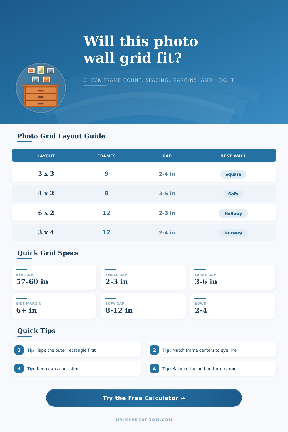
| 3 x 3 square grid | 9 frames | 12 x 12 or 16 x 16 in | 42 to 56 in square with gaps. |
| 4 x 2 sofa wall | 8 frames | 16 x 20 in portrait | 76 x 45 in with 4 in gaps. |
| 6 x 2 hallway row | 12 frames | 12 x 16 in portrait | 87 x 35 in with 3 in gaps. |
| 3 x 4 tall entry grid | 12 frames | 8 x 8 or 10 x 10 in | 28 to 36 in wide, 38 to 46 in tall. |
| Score | Meaning | What to adjust | Typical cause |
|---|---|---|---|
| 90 to 100 | Strong grid layout | Mark corners and centers before hanging | Good fit, steady spacing, centerline near eye line. |
| 75 to 89 | Usable with small tweaks | Refine top margin or gap size | One margin or centerline value is slightly off. |
| 55 to 74 | Needs adjustment | Reduce columns, frame size, or spacing | Grid may feel crowded or high on the wall. |
| Under 55 | Likely poor fit | Change frame count or wall location | Overflow, cramped margins, or center far from eye line. |
Have you ever found yourself staring at a pile of empty frames on your wall wondering how on earth you’re going to get them all to fit? It’s the stuff of nightmares! What began as a well-intentioned project, like borrowing someone’s measuring tape and hoping for the best. Ends in tears, or at least I think it would.
Most folks measures the width of their individual frames. Then they multiply that by how many they have, and voilà! Problem solved. Disaster avoided…NOT. Because guess what? You’ve forgotten about the gap between each frame! The space between your frames is nearly as important than the pieces of wood or metal surrounding them. To ignore spacing means you’ll end up with a gallery wall more like a haphazard collage then a carefully planned design element.
How to Space Your Frames on a Wall
This is where the calculator comes into play. The calculator above do all the grunt work for you, adding together frame widths, columns, and spacing horizontally across, producing the grand total of the grid’s overall dimensions. So you don’t have to stand on a step ladder with drywall anchors in one hand trying to do math in your head, not to mention making a mistake.
What are those numbers telling you about how they relate to your space? One thing calculated in the tool is the centerline height. That is center point vertically of the whole thing. Typically interior designers aims for this being around 57-60″ off the ground. It works because we tend to hold our heads at roughly that height when standing upright. When the centerline becomes higher than this it can make the room feel top heavy. When it’s lower, it makes the room appear as if the wall is sagging beneath the weight of the pictures.
More than you might think, getting the balance right are about fiddling with margins. These are the voids on both sides of your grid when it’s centered on the wall: the side margins. You don’t want them to appear accidental; you want them to be intentional. On the one hand, too much open air gives the impression that the grid itself is small and lost in the emptiness of the room. On the other hand, cramming up against a corner gives the impression that you simply didn’t have enough wall space.
The tool weights this relationship heavily in its layout score. It penalizes uneven breathing room because it creates visual tension that pulls focus away from the photos themselves. Ideally, you’d want the eye to move through the images… Not pause to wonder why the bottom seems crowded but the top seems empty.
The amount of room required between pieces depend also upon your frame style. Low-visual-weight thin metal frames allow for close placement because they don’t take up much visual space. They don’t compete; they let the pictures do all the talking. But thick wood frames with mats is another beast altogether. All that matting increases both the width and depth of the piece. This increase its footprint and requires more empty space, or else things get muddy. Tack matted portraits two inches apart? You’re going to end up with a solid block of beige in place of separate works of art.
That’s easy enough to see in the reference table on the page which illustrates how bigger frames require wider gaps to keep the rhythm intact. It’s all about proportion. An eight by ten snapshot needs more empty space around it than a six by twelve inch piece, just to give the eye someplace to rest between pictures.
Many people gets so hung up on where every single hook will be, before determining what the overall shape ought to be. Wrong. The outer rectangle, which makes up the whole grid, comes first. Determine the dimensions of the entire thing (width plus spaces between, and height plus spaces between), then determine the midpoint of this giant imaginary rectangle on your wall. From there, you can easily work out the layout of the interior cells. Before nailing anything down, tape the outline to see how it looks. It’s a small step, but checking the overall shape first stops you from arranging each frame separately and ending up with something that wobbles off-center.
Then there’s flow, which will be the last check in any project. Is the grid still grounded? Are the spacings all close enough to appear on purpose, not random? Your eye will have to judge looks, although the tool should of helped verify the mechanics. Half an inch can make a difference between tight and moddern feeling and airy and traditional. Get it right before picking up the drill.
When it comes down to it, a well-spaced out grid makes a living room or hallway a curated experience, so planning ahead turns potential chaos into calm.