House Number Size Calculator
Size address digits from real viewing conditions: distance from the road, traffic speed, contrast, lighting, mounting height, digit count, stroke width, and plaque width.
Pick a starting point, then adjust the exact distance, mounting, lighting, and number of digits for your home.
Switch units any time. Metric values are converted internally so the visibility math stays consistent.
Recommended House Number Size
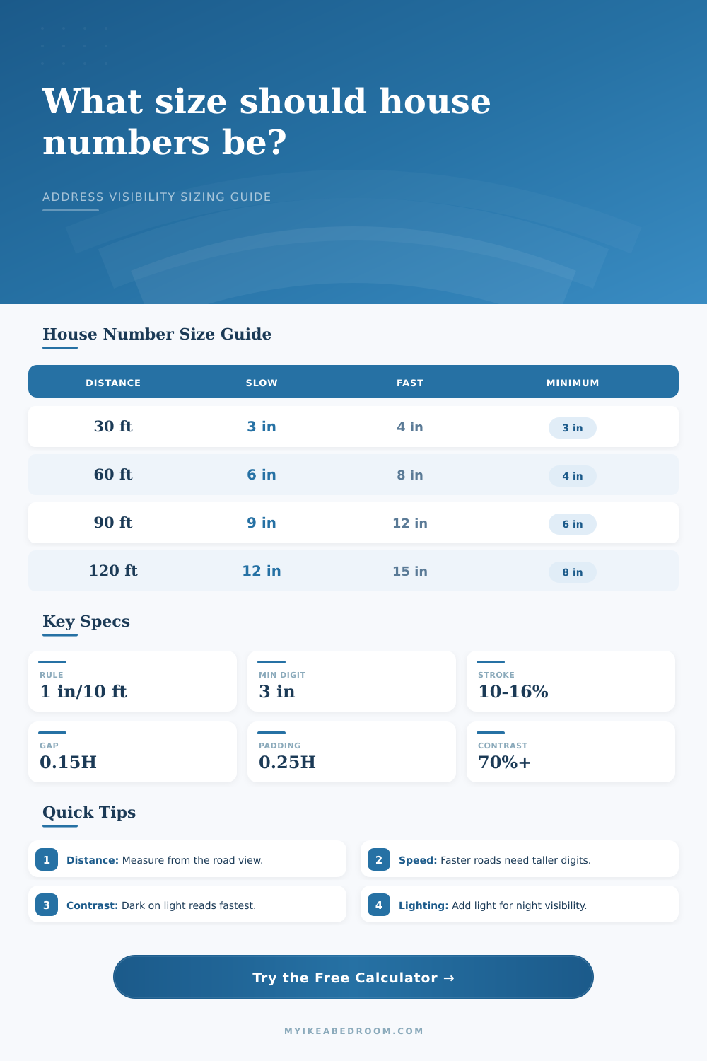
| Viewing Distance | Walk / 15 mph | 25-35 mph | 45 mph+ |
|---|---|---|---|
| 25 ft / 7.6 m | 3 in / 7.6 cm | 4 in / 10.2 cm | 5 in / 12.7 cm |
| 50 ft / 15.2 m | 5 in / 12.7 cm | 7 in / 17.8 cm | 9 in / 22.9 cm |
| 75 ft / 22.9 m | 8 in / 20.3 cm | 10 in / 25.4 cm | 13 in / 33 cm |
| 100 ft / 30.5 m | 10 in / 25.4 cm | 13 in / 33 cm | 17 in / 43.2 cm |
| Condition | Multiplier | When To Use | Design Move |
|---|---|---|---|
| Excellent contrast | 1.00 | White on navy, black on white | Keep surface plain |
| Fair contrast | 1.25 | Tone-on-tone, brick, stone, shadow | Use a backing plate |
| Unlit night view | 1.30 | No direct fixture or reflector | Add address lighting |
| Decorative digits | 1.45 | Script, thin strokes, ornate shapes | Increase height |
| Digit Count | Digit Width Guide | Gap Guide | Plaque Width Formula |
|---|---|---|---|
| 2 digits | 1.24 x height | 1 gap | 1.24H + gap + padding |
| 3 digits | 1.86 x height | 2 gaps | 1.86H + gaps + padding |
| 4 digits | 2.48 x height | 3 gaps | 2.48H + gaps + padding |
| 5 digits | 3.10 x height | 4 gaps | 3.10H + gaps + padding |
| Mounting Center | Visibility Effect | Best For | Adjustment |
|---|---|---|---|
| 3-4 ft / 0.9-1.2 m | Low, can be hidden by plants | Mailbox posts | Add 5-10% |
| 4-6 ft / 1.2-1.8 m | Near eye line | Porch, column, fence | Base size |
| 7-9 ft / 2.1-2.7 m | Readable but angled upward | Transom, garage header | Add 10-20% |
| 10 ft+ / 3 m+ | Harder from close range | Long drive signs | Add 20-25% |
Your house numbers matter. You might think that you can get away with making your house number an afterthought; but next time the delivery guy gets frustrated by circling around your block, remember how you made him feel.
From a distance, he sees address on your house… then as his car approaches, the numbers dissapears. Often, homeowners selects tiny decorative numbers that appear great up-close but vanish at 20 miles per hour. The question isn’t whether or not it’s visible within a stationary environment. It’s visible in-motion, in-changing-light, and among a flurry of background element.
How to Pick the Right House Number Size
Typically, folks will begin with a rule of thumb: one inch per every ten feet. That’s not bad as a starting point for a quiet residential street with lots of contrast. But it assume that drivers is looking straight ahead at the full height of your house. And they’re not.
What speed do you drive? Because faster is different than slow. A driver going 45 mph doesn’t have anywhere near the same reaction time that a driver going 15 mph has. The base size increases in direct proportion to this slower reaction time, which mean there is less time for the brain to take in visual data. So the number itself get larger. It’s a correction for blur, it’s a compensation.
Visibility also depends heavily on contrast. For example, most of us would think that a light-colored wall with dark numbers will be easily read. While that’s often true, the texture of the surface make a difference too. On a smooth wall, a white number on a navy background works; but on textured stucco or a busy brick pattern, the darker number blend right into the wall.
The system take into account your specific contrast situation. A solid navy background with sharp white digits is easier to read than say, a decorative tone-on-tone treatment. Do you want to use an elaborate font? Or perhaps you want a muted palette? It recommends making the digits slightly bigger, so they remains visible without compromising style.
The geometry of mounting height adds another wrinkle. Numbers mounted too low gets hidden by parked cars or shrubs. Mounting the numbers too high makes the driver have to crane his/her neck, that creates an angle that distorts perception. For a standing adult, about eye level is the sweet spot. It is about four to six feet off the ground. For designs where they must be mounted much higher than this, you adjust the size to make up for that angular distance. Even from a steep upward angle, the digits is still big enough to read.
At night, however, it’s a different story: Lighting compounds the issue. A daytime-visible sign may be nothing but black shadows by evening. And what kind of lighting do you have? Will you rely on ambient porch lighting? Reflective signs? Will you use address lights specifically for this purpose? If you’re doing this in the dark (as in, no ambient light), then you’ll need really big numbers to see them. The calculator bumps up its recommendation accordingly so that you don’t end up with something that nobody sees by nighttime.
What distinguishes a pro’s install from a jumble is spacing and stroke width. When digits are cramped, they become indistinguishable and your brain has to guess at what it’s seeing. Proper stroke width and enough gap space between numbers makes each individual digit stand on its own. To do this, the tool figures out how much space you have for all of the numbers with proper padding. It is not simply that the numbers will be large. The numbers will be distinguishable.
Get the right size the first time so there are no more wrong delivered packages. No more visitors to circle in your driveway too late at night, it is a thoughtful little gesture. And it pays back every day because when people come here, they want to get where you are easily. They won’t have to guess where your door is, or where your helpers and guest are.