🎨 Color Wheel Calculator
Enter any hex color to instantly generate harmonious color palettes — complementary, triadic, analogous & more
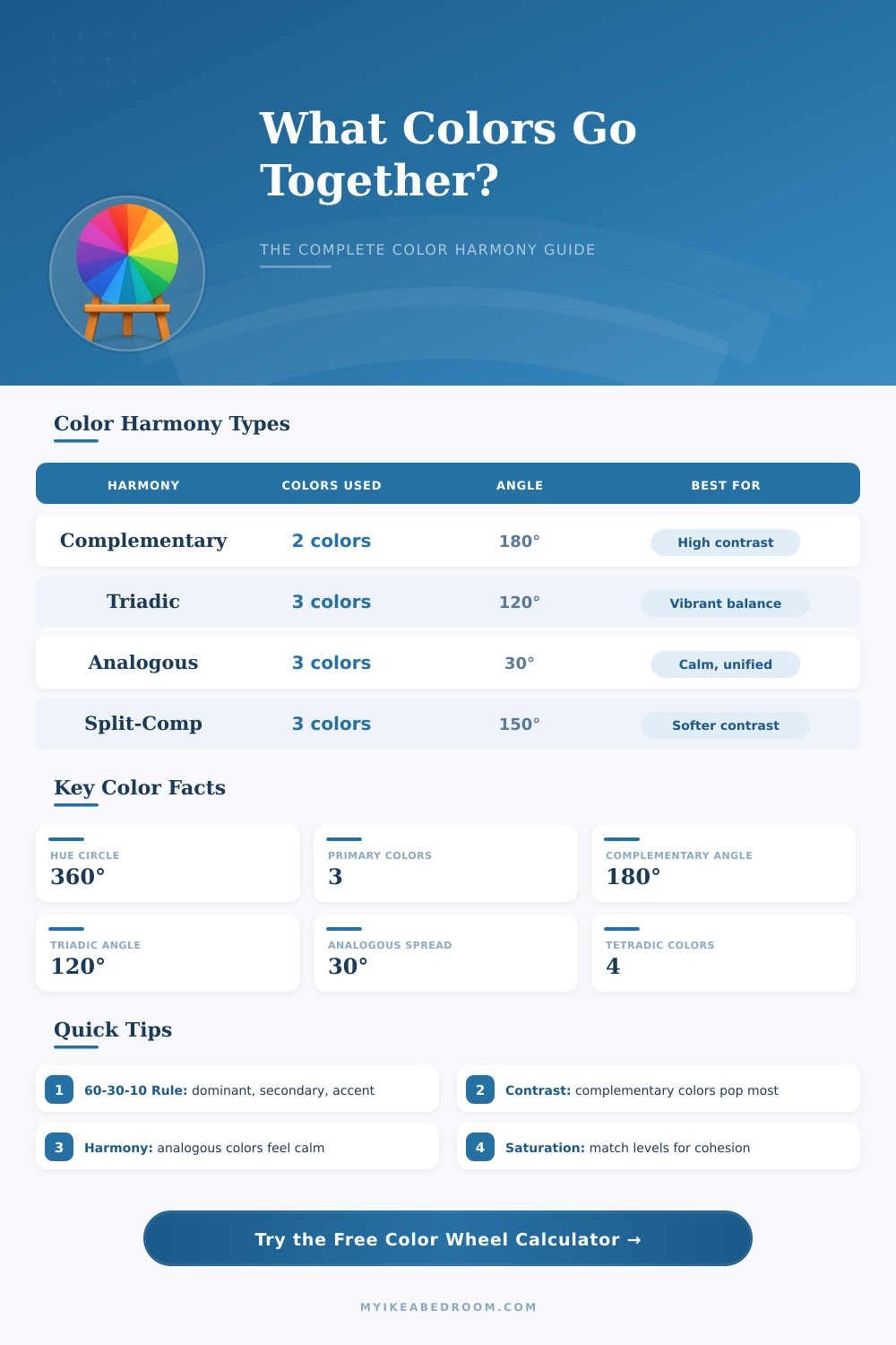
| Harmony Type | Angle(s) | Colors Generated | Best Use Case |
|---|---|---|---|
| Complementary | 180° | 2 colors | High contrast, call-to-action buttons |
| Analogous | ±30° | 3 colors | Calm, unified designs, nature themes |
| Triadic | 120° | 3 colors | Vibrant, balanced, playful designs |
| Split-Complementary | 150° / 210° | 3 colors | High contrast but softer than complementary |
| Tetradic / Square | 90° | 4 colors | Rich palettes, complex visual variety |
| Monochromatic | 0° | 2–6 tints/shades | Elegant, minimal, professional look |
| Component | Range | Description | Effect at Extremes |
|---|---|---|---|
| Hue (H) | 0° – 360° | The base color angle | 0/360° = Red, 120° = Green, 240° = Blue |
| Saturation (S) | 0% – 100% | Color intensity / purity | 0% = Gray, 100% = Vivid color |
| Lightness (L) | 0% – 100% | Brightness of the color | 0% = Black, 50% = Pure, 100% = White |
| Tint | L > 50% | Color mixed with white | Lighter, pastel versions |
| Shade | L < 50% | Color mixed with black | Darker, richer versions |
| Tone | S < 100% | Color mixed with gray | Muted, sophisticated feel |
| Color Name | HSL Hue Angle | Complementary | Common Use |
|---|---|---|---|
| Red | 0° | Cyan (180°) | Energy, urgency, passion |
| Orange | 30° | Azure (210°) | Warmth, creativity, enthusiasm |
| Yellow | 60° | Blue (240°) | Optimism, clarity, attention |
| Green | 120° | Magenta (300°) | Nature, growth, harmony |
| Cyan | 180° | Red (0°) | Technology, calm, clarity |
| Blue | 240° | Yellow (60°) | Trust, stability, depth |
| Magenta | 300° | Green (120°) | Creativity, luxury, romance |
| Purple | 270° | Chartreuse (90°) | Royalty, mystery, wisdom |
A color wheel is simply a round chart that helps to understand how colors link between themselves. It gathers all shades of colors and sorts them in a circle to show the ties between basic, secondary and tertiary colors. The main advantage it has is that it shows the flow of colors one with the other.
At its base, it serves as a useful tool for anyone that wants to learn about colors and the range that affects the creative work from one aspect to the other.
How the Color Wheel Works
Sir Isaac Newton showed this idea already in 1666. Since then artists and scientists made many versions of his first idea. Here the point even so.
There is not only one “right” color wheel. Various versions appear, because folks always try to simplify the trouble of light and fit it in an easily understood form.
Two main models rule this area. The RYB system is based on red, yellow and blue as main elements, and artists like it, because those are the colors that one truly mixes when working with paintings. Later comes the RGB version, based on red, green and blue, that was desgined for computer screens and digital tasks, because it deals with blending of light, as do monitors and televisions.
Basic colors. Red, yellow and blue. Stand at the center of everything.
If you mix them, you get secondary colors. For instance, blue with yellow gives green, red with blue results in purple, while red and yellow create orange. Tertiary colors come from more complex mixes.
Depending on the kind of wheel, one can sea only six colors, or maybe twenty-two, or even more shades between them with endless tiny differences.
The wheel helps to also identify the tone of any color. Even so, any two-dimensional image loses many of those subtle shades. In some wheels, the tones sit around the outer edge, while the brightness moves more to the center.
Here what is interesting though, the wavelength of light does not truly match our sense of tones.
Designers and artists commonly use the color wheel to find ranges that truly look good. It forms the base of the theory about colors. Matching colors sit right on the opposite side one to the other on the wheel.
Take two opposite colors, for instance orange and blue, and you create visual strength and depth, which draws the eye. Similar colors are made up of two, three or four shades that sit close one to the other. If you choose three neighbors, you always find something that works well.
There are also triple and four-part patterns, if one wants something more complex.
Digital programs and web apps allow you to pick a base color and right away create matching ideas. Even so, honestly, drawing your own color wheel byhand is a good way to truly feel the rhythm of colors and create something you can use while working on an image.