🎨 Color Contrast Calculator
Check WCAG 2.1 contrast ratios for AA & AAA accessibility compliance
| Context | WCAG AA Min | WCAG AAA Min | Notes |
|---|---|---|---|
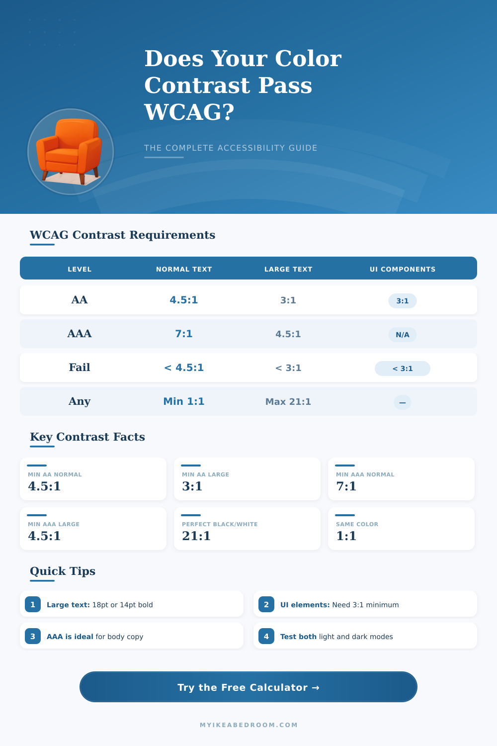
| Normal text (<18pt, not bold) | 4.5:1 | 7:1 | Most body copy |
| Large text (18pt+ regular) | 3:1 | 4.5:1 | Headlines, h1-h2 |
| Large text (14pt+ bold) | 3:1 | 4.5:1 | Bold subheadings |
| UI components & icons | 3:1 | N/A | Borders, focus rings |
| Decorative elements | None | None | No requirement |
| Disabled controls | None | None | Exempt from WCAG |
| Logo / brand text | None | None | Exempt from WCAG |
| Foreground | Background | Ratio | AA Pass? |
|---|---|---|---|
| #000000 Black | #ffffff White | 21:1 | ✅ AAA |
| #ffffff White | #000000 Black | 21:1 | ✅ AAA |
| #767676 Gray | #ffffff White | 4.54:1 | ✅ AA |
| #595959 Gray | #ffffff White | 7.0:1 | ✅ AAA |
| #ff0000 Red | #ffffff White | 4.0:1 | ❌ Fail |
| #0000ff Blue | #ffffff White | 8.59:1 | ✅ AAA |
| #00ff00 Green | #ffffff White | 1.37:1 | ❌ Fail |
| #ffff00 Yellow | #ffffff White | 1.07:1 | ❌ Fail |
| #003E72 Navy | #ffffff White | 10.5:1 | ✅ AAA |
| #ffffff White | #0058A3 Blue | 5.03:1 | ✅ AA |
| Color | Hex | Luminance (L) | vs White Ratio |
|---|---|---|---|
| White | #ffffff | 1.000 | 1:1 |
| Light Gray | #eeeeee | 0.870 | 1.24:1 |
| Silver | #c0c0c0 | 0.561 | 1.95:1 |
| Medium Gray | #808080 | 0.216 | 5.07:1 |
| Dark Gray | #404040 | 0.052 | 18.1:1 |
| Black | #000000 | 0.000 | 21:1 |
| Red | #ff0000 | 0.213 | 4.0:1 vs white |
| Green | #00ff00 | 0.715 | 1.37:1 vs white |
| Blue | #0000ff | 0.072 | 8.59:1 vs white |
| Yellow | #ffff00 | 0.928 | 1.07:1 vs white |
Color Contrast simply shows the difference in brightness between the front color and that of the background. One measures it by means of special tools that deliver a ratio. Those ratios range from 1:1 which means entirely no difference (for example white on white), to 21:1, the strongest possible contrast (like black on white).
Using black and white in design one reaches the highest possible ratio of contrast.
Color Contrast Made Simple
There are programs that allow you to check the contrast between various color pairs. One can enter hex codes, six-character sequences, that show colors for both the front part and the background. Some of those tools include a color selector that helps to choose colors directly from a page or image.
Just enter two such codes and click, so that the levels of contrast and the points show up clearly.
WCAG standards form the main agreement in that field. For WCAG 2.0 on level AA, you need at least 4.5:1 for normal letters and 3:1 for big. Big text is either bold with at least 19 pixels, or anything of 24 pixels up.
Those values help to ensure that the content stays readable for people with slightly weak sight or color blindness. Various visual problems commonly reduce the sense of contrast, hence enough difference between bright and dark parts matters, no matter what colors are used.
Even folks without known visual issues hardly read low-contrast material on mobile devices or under strong sunshine. When color alone carries the message, users that cannot tell the differences can entirely lose important information. As more web users age, such accessible changes become even more important, so that they can browse the net freely.
When text does not pass the contrast test, an easy fix is to change its color to a version with better contrast. It could include choice of a lighter or darker tone. Otherwise one can change the background the other way.
Good recall: dark backgrounds go with bright letters, and bright backgrounds with dark.
Color Contrast does not limit to outer looks. In mainstream design there is no single recipe for good contrast. It requires experience and an eye for detail.
Even so on the net it is required. Meeting the demands about ratios are among the simplest steps to good access. Using the same color withdifferent strengths also gives an elegant and gentle contrast feel.