Monochromatic Color Palette Generator
Build a bedroom palette from one base color, then tune brightness, saturation, tint spacing, accent strength, undertone fit, and accessibility contrast before assigning each tone to walls, textiles, storage, trim, and small details.
| Step size | Palette feel | Best bedroom use | Watch point |
|---|---|---|---|
| 5% to 7% | Subtle wash | Warm whites, greige, pale blue bedding | Swatches may look too close in dim corners |
| 8% to 11% | Balanced ladder | Most wall, wardrobe, textile palettes | Check contrast before using mid tones for labels |
| 12% to 15% | Decorative contrast | Built-ins, paneled walls, shelving zones | High shifts can feel striped on large walls |
| 16% to 18% | Graphic contrast | Office nooks, reading corners, display walls | Reserve deepest tones for small areas |
| Target | Meaning | Use on palette | Bedroom example |
|---|---|---|---|
| 3:1 | Large text or icons | Decor labels, oversized numbers, big drawer tags | Large shelf labels on a closet face |
| 4.5:1 | AA normal text | Most readable text, controls, small labels | Desk calendar, planner board, lamp switch label |
| 7:1 | AAA normal text | High comfort reading and low-vision support | Office nook notes or bedside reading panel |
| 9:1 plus | Very strong contrast | Safety labels, tiny text, deep built-in shelves | Dark wardrobe with white label tape |
| Undertone | Color math nudge | Pairs with | Bedroom note |
|---|---|---|---|
| Warm | Hue warms slightly and saturation softens | Oak, brass, rattan, cream fabric | Helps cool bases feel calmer beside warm furniture |
| Cool | Hue cools slightly and shadows stay cleaner | Ash, chrome, white metal, gray glass | Useful for crisp wardrobes and blue-gray bedding |
| Neutral | Hue remains close to the original hex | Birch, matte black, white laminate | Best when the room already has mixed neutrals |
| Mixed | Saturation moderates for easier pairing | Mixed woods, black rails, brass lamps | Reduces clashes when furniture finishes vary |
| Accent setting | Dominant | Support | Accent |
|---|---|---|---|
| Quiet accent | 70% pale tint | 25% mid tone | 5% deepest shade |
| Medium accent | 60% pale tint | 30% mid tone | 10% deepest shade |
| Bold accent | 55% pale tint | 30% mid tone | 15% deepest shade |
| Gallery-level accent | 50% pale tint | 30% mid tone | 20% deepest shade |
A monochromatic color palette involve the use of one color in a room, but in a variety of different versions of that color. A monochromatic color palette dont mean using the same color on all the surfaces in the room… That can lead to the perception of a cardboard box or an hotel room.
Instead, you should use the color in a variety of different values. Values refers to the lightness or darkness of a color, and the use of different values will provide visual interest to the room. Using only one value will make the room visual flat, so a variety of values of the same color are required.
How to Use One Color in a Room
To create a monochromatic color palette, it is important to understand how light can impact the color of an object. Colors appears differently in different lights, and you must take that into consideration when selecting the base color for your palette. For instance, a color may appear best with bright light in one area of the room, but in dim light in another area of that same room.
If you are using light to highlight an object in the room, you may want to choose a base color that includes more lightness (lighter colors) than one that you would use in a different area of the same space. Additionally, the lighting of the area of the room in which it will be used can also affect the saturation of the base color. Once you have a base color for your monochromatic palette, you need to create a variety of tone by using tints and shades of that color.
Tints is created when color is mixed with white, and color creates shades when mixed with black. You should ensure that the contrast between your tints and shades are not too contrast with each other. If the contrast between each of the tints and shades is too high, it can make the room visually fragmented and difficult to look at for long periods of time.
Additionally, the contrast between the tints and shades should not be too low. If there is very low contrast between the tints and shades, the visual interest of the room may lacking. Another consideration in the use of a monochromatic color palette is the color of the furnitures in the room.
For instance, if orange oak flooring makes the floor, it may conflict with a cool blue color palette. In this case, however, you can adjust the color palette of the room to complement the color of the flooring. A final consideration in the implementation of a monochromatic color palette is the ratio of each color in the room.
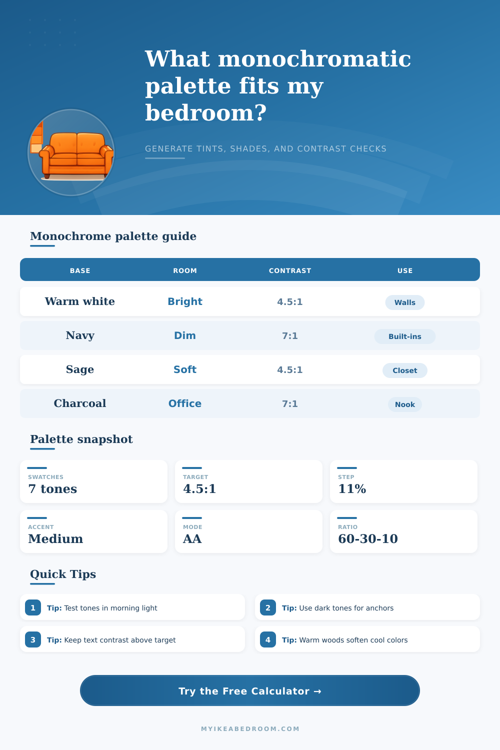
Ratios can help to visually balance the room. A popular ratio for a monochromatic color palette are in the range from 60 to 30 to 10. The color can represent 60 percent of the room (such as the walls of the room).
The 30 percent of the area of the room can be item such as rugs in the room. Finally, decor items in the room can represent the 10 percent of the area of the room. You should also ensure that there is a contrast between the darkest values of the color and the lightest values of that color.
Contrast is the difference between light and dark colors. For instance, if the color is used for a shelf in the room and the objects on the shelf are also that color, there will be no contrast between those objects and the shelf. Therefore, you should ensure contrast between the darkest colors and the lightest colors in the monochromatic color palette.
Finally, a monochromatic color palette will be successful if it remove any color conflict from the room. A monochromatic color palette will work to create visual interest in the room due to the contrast between the various values of the color. Additionally, the fact that the colors do not fight each other or conflict with each other allow individuals to focus on the texture of items in the room (such as wooden furniture) or the softness of the lighting in the room.
As such, if you control the saturation of each color in the palette and the contrast between each color, you will create a visually interesting room that is also more comfortabley for the individuals in that space.