Gallery Ledge Shelf Length Calculator
Size a picture ledge row from wall width, frame count, frame widths, spacing, end margins, overlap style, and row count before you drill.
Presets fill real wall and frame mixes for quick ledge sizing. You can adjust every field after selecting one.
MOSSLANDA style ledge
Best for: lightweight frames, prints, and kids room art.
Planning note: treat 21.75, 45.25, and 55.13 inch runs as common module lengths.
Solid wood picture ledge
Best for: custom wall spans and heavier layered frames.
Planning note: keep long rows straight with anchors near both ends and the center.
Metal display rail
Best for: slim modern rows and frequent art swaps.
Planning note: choose light overlap because thin rails show crowded edges quickly.
Nursery book ledge
Best for: front-facing books, small frames, and rotating favorites.
Planning note: use dense overlap, but leave more end margin for little hands.
| Wall location | Usable wall | Typical frames | Suggested row length | Spacing target |
|---|---|---|---|---|
| Small entry wall | 42-54 in | 3-4 frames | 34-46 in | 2-3 in |
| Hallway gallery | 60-84 in | 5-7 frames | 48-72 in | 2.5-3.5 in |
| Sofa wall | 84-120 in | 6-10 frames | 60-90 in | 3-5 in |
| Nursery book row | 36-72 in | 6-12 books | 30-60 in | 1-2 in |
| Stacked office rows | 72-108 in | 8-14 frames | 42-66 in each | 2-4 in |
| Overlap style | Visible width reduction | Side allowance | Best use | Balance risk |
|---|---|---|---|---|
| No overlap | 0% of adjacent width | 1 in per side | Formal frame spacing | Can look stiff if spacing is wide |
| Light overlap | 5% of adjacent width | 1.5 in per side | Casual gallery ledges | Usually the safest default |
| Layered overlap | 12% of adjacent width | 2.25 in per side | Mixed frame depths | Needs tall frames behind short frames |
| Dense overlap | 18% of adjacent width | 3 in per side | Books, postcards, small prints | Can hide art edges quickly |
| Frame width range | Clean spacing | Layered spacing | End margin | Visual note |
|---|---|---|---|---|
| 4-7 in | 1.5-2.5 in | 0.5-1.5 in | 2-4 in | Good for postcards and small books |
| 8-12 in | 2-4 in | 1-2.5 in | 3-5 in | Most balanced mixed frame size |
| 13-18 in | 3-5 in | 1.5-3 in | 4-7 in | Use fewer frames per ledge row |
| 19-28 in | 4-7 in | 2-4 in | 5-9 in | Use one large piece as the anchor |
| Ledge type | Typical depth | Good row length | Frame mix | Mounting note |
|---|---|---|---|---|
| Painted MDF ledge | 3-4 in | 24-55 in | Light frames and prints | Use anchors where studs are not available |
| Solid pine ledge | 3.5-5 in | 36-96 in | Mixed wood and glass frames | Pre-drill to keep the ledge straight |
| Oak or hardwood ledge | 4-6 in | 48-120 in | Heavier layered displays | Fasten into studs for long rows |
| Aluminum display rail | 2-3 in | 24-72 in | Slim prints and acrylic frames | Check the lip depth before layering |
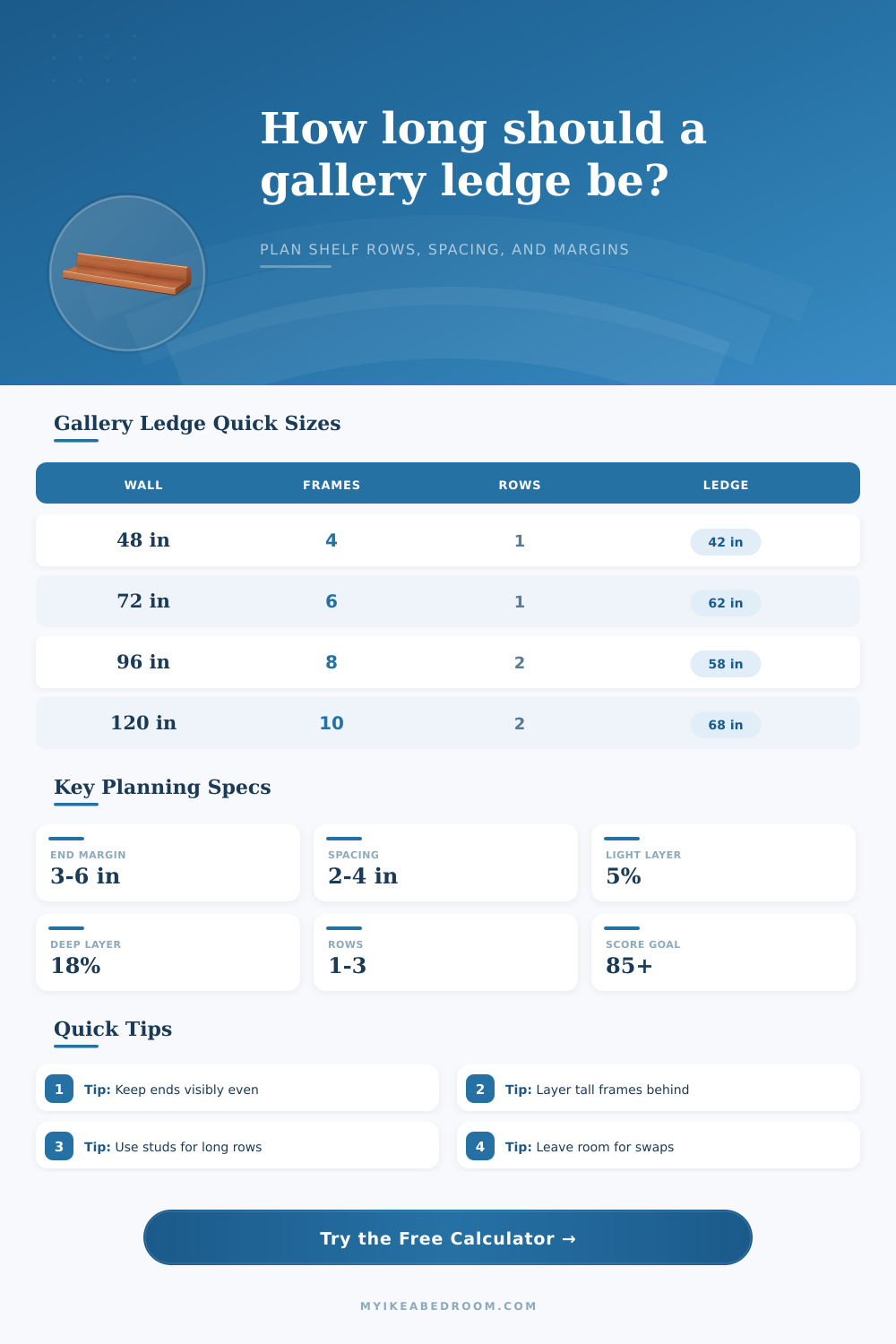
Balance the end margins. A ledge usually looks intentional when each end margin is close to the frame spacing multiplied by 1.25 to 2.0.
Plan for future swaps. If the row will change often, add 1 to 2 inches of overhang beyond the calculated frame run so the layout does not feel maxed out.
The frames is selected. The mat colors are selected. There’s a level and a pencil clutched in your hands as you face a blank section of wall. Now what? That sense of home decoration project-induced anxiety kicks in. Will it look huge between the window and the couch? Or will it look ridiculously tiny? It isn’t simply about fitting wood into drywall. It’s about building a visual rhythm that doesn’t turn your living room into a thrift store clearance rack, In all of this, sizing matters.
After entering dimensions of your frame and wall width, the calculator does the math for you (above). No more conversions, no more coefficient guesswork, just get the answer straight away. And it turns the idea of balance into actualy inches.
How to Hang Frames on a Wall
First, let’s talk about why end margins are so important. What most folks do is jam their frames right up against the edge of the shelf with no buffer at all. That creates a claustrophobic feeling, like the art is being squeezed and trapped between the furnitures. With three to six inches of margin on either end, you’re providing some visual breathing room. You’re telling the eye this display wasn’t pushed into whatever space was leftover; that it was put there with intention.
Next, what’s the gap between each frame? That’s where people fail, they’re thinking that all their frames has to be equally isolated from each other. No: think about this more like a paragraph on a printed page. Not all words have the same length. You don’t want them all uniform; you want variety in width, but also rhythm in line lengths. The calculator helps you figure out how long a piece should be based off its height compared to the overall run.
How much does the big 20-incher demand? How far should it hang past its neighbor? Does it matter whether we use overlap style or not? If you want overlap (which mimics a casual designer’s studio aesthetic, where books peek out from behind prints and smaller frames nestle against larger ones), then a bit of light overlap reduces the visible width of the row. That way you can fit more onto a row but not have overall shelf feel overcrowded. On the other hand, dense overlap isn’t as good. It would of been great for displaying many books in a nursery to show variety rather than depth, or for displaying many rotating postcards. Because if your shelves don’t overlap at all, they may appear sparse once you begin to stack things deep behind each other. The tool calculates the ledge length to prevent shelves from looking empty when you stack items deep behind one another.
What is the material? A thin metal rail will expose every misaligned gap immediately; you have to be precise. A thicker solid wood ledge can absorbs more visual weight and get away with looser arrangements and heftier frames that don’t feel shaky. The reference table on the page provides a starting point: before you measure in your own home, here’s what a standard length looks like for an ordinary space across many common wall widths. A long, narrow arrangement works better for a gallery in a hallway than a smaller display in an entryway, where the shape of the room changes based off how it is built.
Another number to keep an eye on is wall usage percentage. If a ledge covers more than eighty percent of available wall width, it can feel oppressive. Something shorter (less than 50%) tends to look small and lost on its own. This changes if it is part of a stacked design with two or more rows of frames side-by-side. Two changes everything, and stacking them vertically must be done carefully so as not to appear like a stack of pancakes.
The calculator gives you a visual sense of this. It shows how many frame go in each row so you know if your plan makes sense visually and physically. The tool also provides a balance score, a rating of how well the visual fits, ranging from zero to one-hundred. Consider it a kind of sanity check. If you have a high score, then the width of the frames, the spacing, and the margins all seem harmonious. When the shelf is hung, your eye will move along its surface in a smooth way without jumping wildly from one hotspot to the next. On the other hand, low scores typically mean you’re leaving empty, awkward spaces at either end, or else cramping more content into less space.
But it’s more about knowing what you’re realy measuring than anything else. You’re not just measuring content, you’re also measuring negative space, in between frames. That’s part of the art: the spaces in-between the glass and the wood. Leave yourself a little overhang when planning out your frame run, so you can swap things out later on. Kids grow up. Life happens. There are always new prints to find at flea markets. A static layout is rigid; a flexible layout is alive.
If you’re at a loss of where to start, try the presets. The nursery setting handles books different than the office art setting does. Play around with the numbers till it feels good to your eye (not necessarily to your tape measure). After the first frame goes up and the level’s been set, the anxiety will subside. You’ll see that the math wasn’t ever so much inches as it was confidence. Go hang that shelf.