Paint Color Mixing Ratio Calculator
Scale base paint, tint colors, thinner, and overage for wall, trim, furniture, and touch-up batches.
🎨Real Color Mixing Presets
🧪Mix Inputs
Scaled Paint Mixing Results
⚖Current Component Split
📋Color Ratio Reference
| Color target | Typical ratio | Best base | Where it fits |
|---|---|---|---|
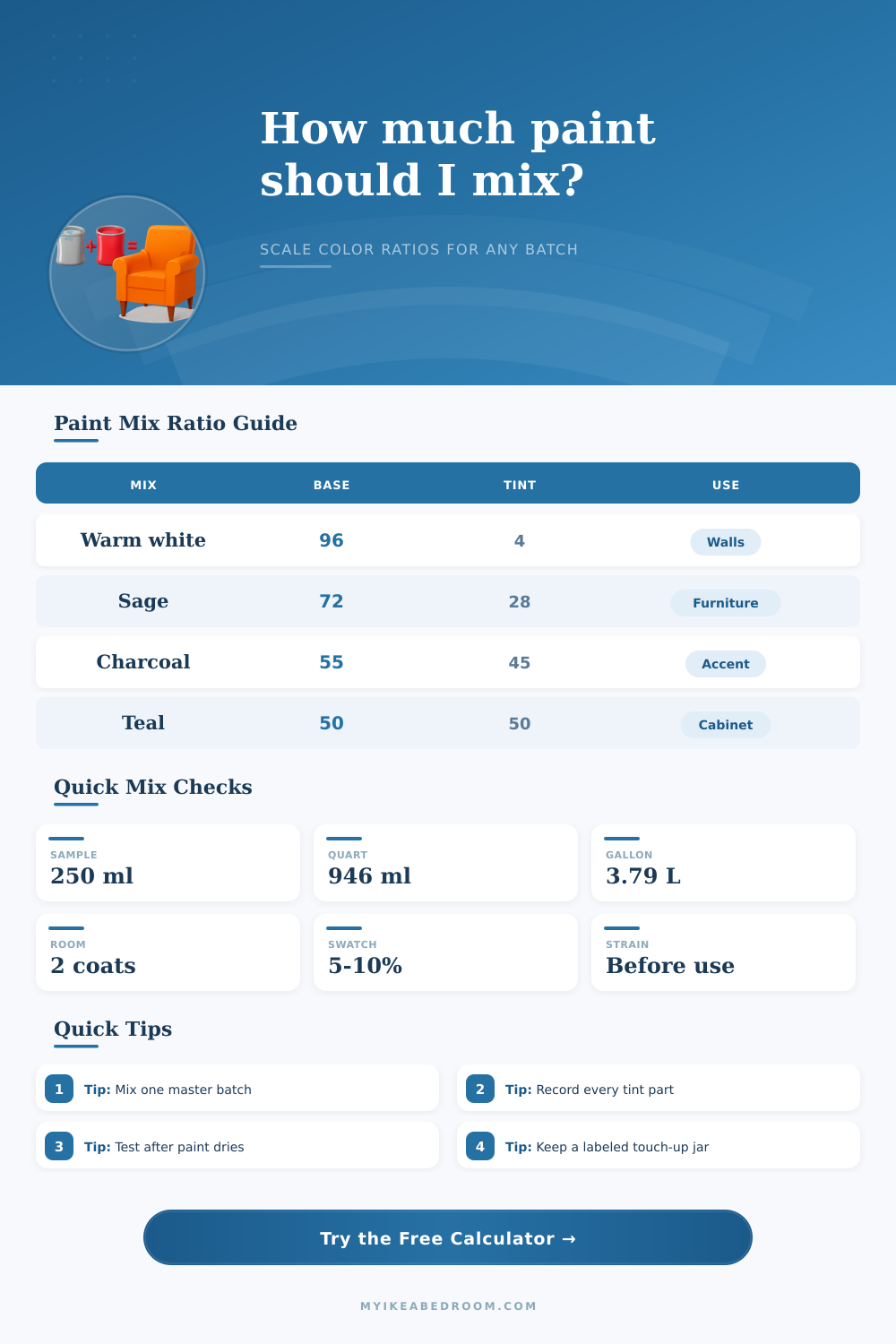
| Warm white | 96 base : 3 ochre : 1 umber | White or extra white | Walls, trim, built-ins |
| Soft greige | 84 base : 8 umber : 6 ochre : 2 black | White or light gray | Bedrooms, calm furniture |
| Sage green | 72 base : 16 green : 8 ochre : 4 umber | White or pale green | Dressers, wardrobes, panels |
| Charcoal | 55 base : 35 black : 10 blue | Deep base | Accent walls, cabinet fronts |
| Dusty blue | 70 base : 20 blue : 7 gray : 3 umber | White or neutral base | Cabinets, nightstands, doors |
📏Volume Conversion Table
| Container | Milliliters | Fluid ounces | Use case |
|---|---|---|---|
| Sample pot | 236 to 250 ml | 8 fl oz | Test board or repair |
| Pint | 473 ml | 16 fl oz | Small furniture piece |
| Quart | 946 ml | 32 fl oz | Dresser or accent wall |
| Half gallon | 1,893 ml | 64 fl oz | Cabinet run or trim |
| Gallon | 3,785 ml | 128 fl oz | Room walls or built-ins |
🖌Tint Strength Guide
| Tint amount | Visual change | Mixing advice | Best test |
|---|---|---|---|
| 1 to 3% | Subtle warmth or coolness | Add slowly and stir fully | White card beside trim |
| 4 to 10% | Clear color shift | Record every addition | Two coat sample board |
| 11 to 25% | Strong custom color | Use a deep enough base | Dry sample in room light |
| 26 to 50% | Dominant tint blend | Mix a single master batch | Compare after 24 hours |
🏠Coverage Planning Table
| Project | Common area | Coats | Approx paint |
|---|---|---|---|
| Nightstand | 20 sq ft | 2 | 120 to 180 ml |
| Dresser front | 45 sq ft | 2 | 300 to 500 ml |
| Accent wall | 120 sq ft | 2 | 1.2 to 1.5 L |
| Bedroom walls | 320 sq ft | 2 | 3.5 to 4.2 L |
| Wardrobe doors | 80 sq ft | 2 | 750 to 950 ml |
🔍Mixing Method Comparison
Touch-Up Match
Use exact batch mode, low overage, and very small tint steps so the repair does not drift darker.
Sample Board
Mix 250 ml, apply two coats, and judge the color only after the sample dries fully.
Furniture Batch
Choose a quart-sized batch, add 10% overage, and keep one sealed jar for later repairs.
Room Batch
Use coverage mode and mix all tinted paint together before rolling the first wall.
💡Paint Mixing Notes
Maybe you’ve been mixing your own paint and noticed that when dry, it was two shades darker than the color swatch indicated. Well, it’s not as uncommon as you may believe. Good intentions typically go to die in the space between wet paint on test card and the final painted wall.
There’s a bit of arithmetic involved with mixing colors, but there’s also lot of chemistry. Most people view it as an intuitive art and rely solely on gut feeling. Gut feeling’s nice, right up until you discover that leftover paint covers exactly half of north wall (and that’s assuming you’ll be able to apply one single coat).
How to Mix Paint Perfectly Every Time
That’s where this comes in: Once you input your chosen ratio and volume, the calculator figure out the rest for you, no more guesswork about what a teaspoon of tint will mean in a quart size batch. Because eyes can trick you but volume never lies, the basic formula is simple: define your base (the majority of whatever the liquid is), then add your tints.
For instance, if you’re painting an ivory-colored warm white wall, maybe you need 96 parts of your base paint for each four parts of oxide tint. That sounds like hardly anything at all. Until you remember that such a tiny percentage makes the difference between cozy cottage and sterile hospital walls. The tool calculates those percentages into actual volumes; now, you can confidently pour and know the color isn’t a wild-eyed guess.
The other half of the equation, which is also frequently overlooked, is coverage estimate. Most paint manufacturers will tell you roughly how much area each gallon covers (roughly 300-400 square feet per gallon per coat on a standard drywall). That figure assume smooth drywall and an experienced roller. High gloss finishes and rough surfaces demand thicker application, so they requires more material to avoid brush marks.
A ten percent overage buffer is not being pessimistic (it’s practical). It is for the small gap revealed after second coat, which always exists. It covers occasional spot behind couch and the unavoidable bit spilled onto the floor.
Beyond the tint selection, selecting an appropriate base is crucial. For example, while white bases are fresh and light, they don’t have much strength when it comes to producing depth in deeper colors (think: dark teal; charcoal). Trying to use that white base for very dark blues is going to result in lots of coats and a lot of battling with opacity.
For these more intense colors, a grey or even black base is what’s needed, this way, the color can realy shine through without all those layers and layers of paint. This becomes very apparent once you check out the reference table on page. It’s easy to see that a clean trim color needs to be painted onto a different base than a sage green dresser. Choosing the right base for your tint is important, it saves money by reducing waste and prevents wasting time, too.
The thing is, that basic ratio goes out the window when additives alter volume (viscosity) while barely impacting the hue. For instance, adding water thins out latex paint so it flow better, but too much will damage its film integrity. A glaze adds working time and some slip, but significantly increases overall liquid volume.
Enter the percentage of the medium or glaze wash you plan to use into the mixing input to ensure the final mixture has enough pigment to coat surface. Failing to do this means you’re not only watering down your consistency, but also the color. This results in uneven coverage which looks unprofessional even if your technique was solid.
All of this has to do with lighting, which plays a silent role: Ambient light is absorbed by the wall; test boards reflect it directly back at you. What looks great in the bright glow of an overhead bulb will look flat and muted when viewed in natural window light. Always test your paint mix on a big board, not a tiny strip. The eye will fool you, seeing more contrast then is really there.
Wait for the paint to dry fully before deciding whether to add some water or more tint. Wet paint always appears richer and darker than it ever would of once it dries, so drying time is non-negotiable.
The one thing I have learned that makes long term projects go smoothly is keeping records. Use painter tape to write exactly what you did down (date, exact ratio and additive percentage) and attach it to the bottom of the jar. That way if you need to touch up a chair leg six months from now, you’ll still know how you mixed it and future you will appreciate having that recipe. Without those notes you won’t be able to have the paint store re-mix it as they don’t do custom mixes unless they have exact information. Feels annoying at the time, but saves you big time later.
There’s nothing magical about mixing paint; it’s just a matter of math. By understanding the proportions, while also factoring in real-life factors such as light and texture, the whole exercise becomes predictable rather than dangerous. The fear of messing up your color choice dissapears once there are numbers on your side! All of a sudden, you have a room that resembles what was imagined, without having to waste money or materials on guesswork.