Neutral Color Palette Generator
Create a calm bedroom palette from one neutral hex color, then tune undertone, contrast, room brightness, wood tone, textile depth, palette count, accent restraint, and accessibility targets.
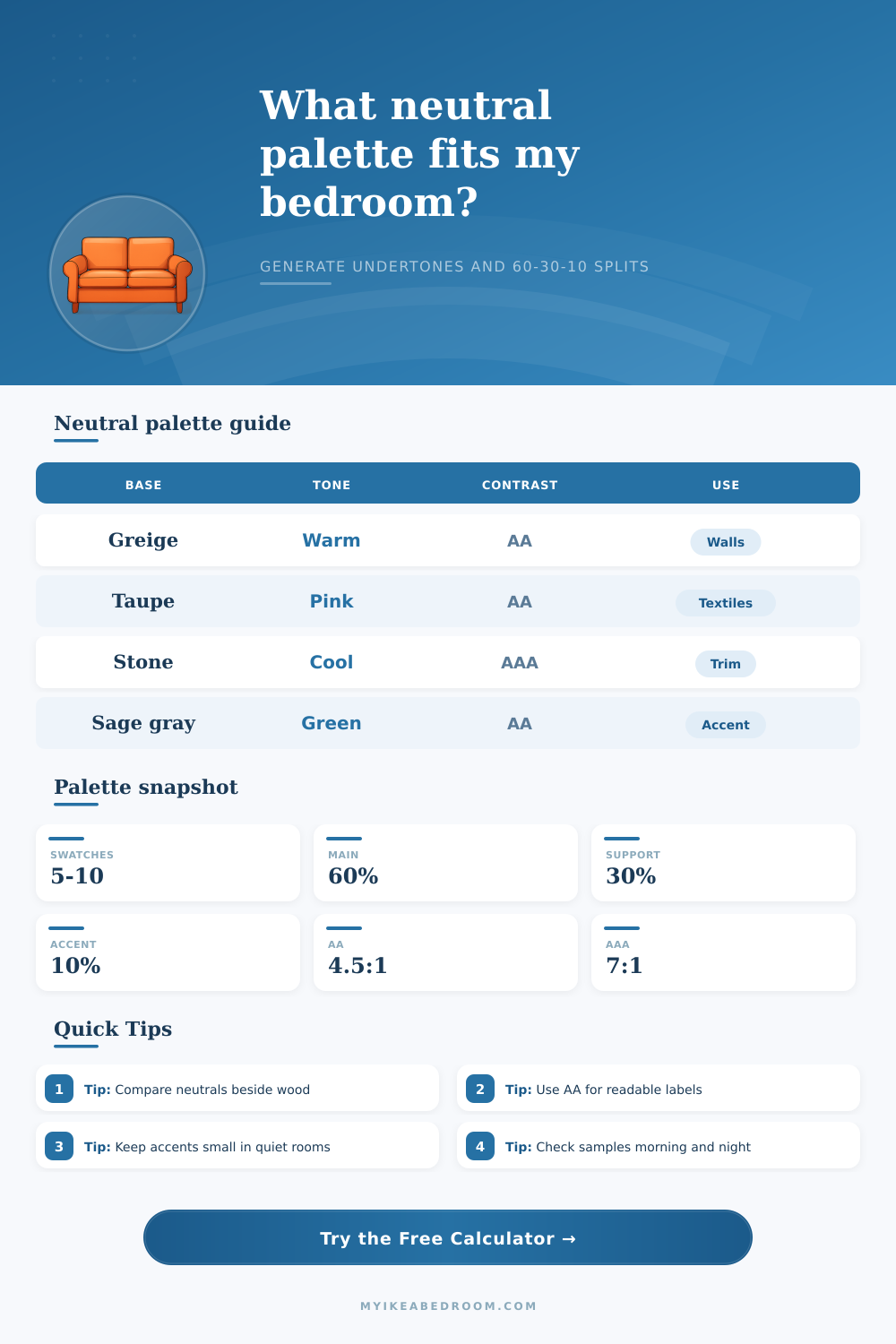
| Undertone | Hue pull | Best wood pair | Bedroom effect |
|---|---|---|---|
| Warm beige | Yellow to red | Oak, walnut, birch | Softens cool daylight and white storage. |
| Cool stone | Blue to violet | Ash, pale oak, black stain | Keeps compact rooms crisp and quiet. |
| Green gray | Yellow green | Oak, ash, smoked veneer | Balances plants, linen, and natural fibers. |
| Pink taupe | Red to magenta | Walnut, oak, cream paint | Adds warmth without reading as pastel. |
| Mode | Ratio target | Use it for | Palette adjustment |
|---|---|---|---|
| Decorative | 3:1 guide | Large swatches and mood boards | Keeps close neutrals together. |
| AA normal | 4.5:1 | Labels, small signs, and controls | Adds a clearer light-dark step. |
| AAA normal | 7:1 | High readability room labels | Pushes one trim or accent much deeper. |
| Labels | 4.5:1 plus | Furniture tags and shelf notes | Prioritizes reliable black or white text. |
| Material cue | Light neutral | Mid neutral | Deep neutral |
|---|---|---|---|
| Pale ash | Cream, chalk, mist | Stone, putty, oyster | Soft graphite or mushroom |
| Natural oak | Oat, linen, warm white | Greige, clay beige | Tobacco taupe or umber |
| Walnut | Ivory, almond, bone | Taupe, mushroom, fawn | Cocoa, espresso, charcoal |
| Deep textiles | Warm white trim | Mixed woven mid tone | One strong 10% anchor |
| Share | Surface role | Good neutral type | Contrast check |
|---|---|---|---|
| 60% | Walls, wardrobes, largest bedding | Quietest light or mid neutral | Readable with black or deep brown. |
| 30% | Curtains, rug, headboard, storage | Support shade one step deeper | Check against wall and bedding. |
| 10% | Frames, lamp, pulls, pillow edge | Deep neutral or restrained accent | Use for strongest text contrast. |
| Trim | Shelves, desk edge, small labels | Clean white or charcoal neutral | Target AA or AAA where readable. |
When you are designing a neutral bedroom, you must use a neutral color palette for the bedroom. A neutral color palette will create a sense of harmony in the bedroom. A neutral color palette mean that you are using a group of colors that work together within the bedroom to create a cohesive environment.
Many people feels that it is easy to choose a neutral color palette for the bedroom. However, it can be difficult to choose the correct colors because different tones of the same color can alter the way that the bedroom appears. For instance, a white paint may appear yellow if you use it on a north-facing wall in the bedroom.
How to Choose Neutral Colors for Your Bedroom
Additionally, a gray paint may appear sterile if you choose it for the bedroom because it lack warmth. The undertone is one of the most important elements to consider in a neutral color palette. The undertone is the hidden color within a neutral color.
For instance, the undertone in a gray may be a hint of green, or the undertone in a taupe may be a hint of red. It is important to identify the undertone of both the paint that is to be use in the bedroom and the color of the flooring in the bedroom. If you use a cool-toned paint for the walls but warm-toned wood flooring, the undertones of these two colors will conflict with one another.
This isnt visually pleasing in a bedroom; therefore, you must find the direction of your undertones so that the colors in your bedroom will effective match with one another. Once you have decided on your color palette for the bedroom, you must use the 60-30-10 rule. The 60-30-10 rule is essential in creating a visually pleasing bedroom.
This rule states that you should use a primary neutral color for 60 percent of the bedroom, a supporting shade for 30 percent of the bedroom, and a deep anchor color for only 10 percent of the bedroom. For instance, you can use your primary neutral color for the bedroom walls and bedding. You can use your supporting shade color in rugs or curtains in the bedroom.
Your deep anchor color can be used only in small items in the bedroom, such as a lamp or a picture frame. Using this color for these items will provide visual contrast in the bedroom. Contrast help create visual interest in a bedroom that otherwise may appear to be flat.
The lighting in the bedroom will play a critical role in how your neutral color palette appears in the bedroom. The lighting will change how you perceive the colors in the bedroom. For instance, if there is alot of sunlight in the bedroom, the colors will appear paler.
However, if there is very little light in the bedroom, the colors will appear to be darker. Because the lighting change the color of the paint in the bedroom, you must adjust the color palette according to the amount of light in the bedroom. For instance, if the bedroom has very little natural light, the colors will need to be lighter so as to avoid giving the bedroom a dark appearance.
You must adjust for the existing light in the bedroom so that the neutral colors appear as you would like them to. The texture of the materials in the bedroom will also play a role in how the neutral colors in the bedroom will appear. The neutral colors will react to the surface of the items in the bedroom.
For instance, matte paint will absorb light, but velvet fabric will reflect it. Therefore, when you select the fabrics for the bedroom, you are also selecting the texture of the bedroom. For instance, linens and cottons will provide a softer, airier feel for the bedroom.
However, heavy fabrics will add visual interest to the bedroom without overpowering the neutral colors. Finally, you can use contrast in your bedroom to enhance the sense of order in your sleep area. Many people dont use enough contrast in their bedrooms.
Using too little contrast will make your bedroom appear washed out. Use the logic of contrast ratios to select your colors to ensure that your colors contrast well with one another. This contrast is what will allow the mind to understand which color is which in the bedroom.
By aligning the wood tones, fabric textures, and light levels in your bedroom, you will have created a cohesive neutral bedroom for sleep.