Triadic Color Scheme Generator
Enter one base hex color, choose the triad rotation style, then balance saturation, lightness, room brightness, undertone, contrast target, and dominant-accent ratios for a practical room palette.
| Option | Rotation Pair | Best Room Use | Visual Effect |
|---|---|---|---|
| Classic triad | 120 and 240 degrees | Balanced bedrooms, offices, and family rooms | Clear three-hue relationship with reliable separation |
| Soft triad | 112 and 248 degrees | Bedrooms and nurseries where contrast should feel calmer | Slightly relaxed spacing with softer tension |
| Wide triad | 128 and 232 degrees | Dining areas, creative studios, and colorful shelves | More expressive hue separation for visible accents |
| Split triad | 150 and 210 degrees | Gallery walls, rugs, art, and textile-led rooms | Two hues sit closer together opposite the base |
| Ratio | Dominant Surface | Secondary Surface | Accent Surface |
|---|---|---|---|
| 70 / 22 / 8 | Walls, wardrobes, large bedding | Curtains, chair, small rug | Lamps, art, handles, vases |
| 60 / 30 / 10 | Walls, closet doors, floor color | Rug, bedding, upholstered seat | Pillows, frames, storage bins |
| 50 / 35 / 15 | One wall family plus large textiles | Second hue in rug or cabinets | Third hue in art and decor |
| 45 / 35 / 20 | Neutralized base on broad zones | Visible second hue in furniture | Bold accent repeated around room |
| Room Light | Lightness Move | Saturation Move | Practical Check |
|---|---|---|---|
| Dim or north-facing | Lift lightness 8 to 14 points | Reduce saturation slightly | Check the wall sample in late afternoon |
| Soft filtered daylight | Lift lightness 3 to 6 points | Keep chroma medium | Use warm lamp light before deciding |
| Balanced daylight | Keep base lightness stable | Use the selected saturation balance | Compare swatches on two walls |
| Very bright white room | Lower lightness 4 to 8 points | Muted colors often read cleaner | Avoid glare behind work surfaces |
| Target | Minimum Ratio | Use Case | Generator Response |
|---|---|---|---|
| Decor only | No text target | Paint, textiles, decor, and swatch planning | Scores visual separation without forcing text safety |
| AA normal | 4.5 to 1 | Labels, small signs, shelf tags, printed plans | Checks best black or white text against each color |
| AAA normal | 7 to 1 | High-readability labels and low-glare work areas | Raises the pass threshold for the contrast score |
| Low vision | 7 to 1 plus wider spacing | Wayfinding, desk zones, controls, and task boards | Boosts contrast weighting and recommends calmer accents |
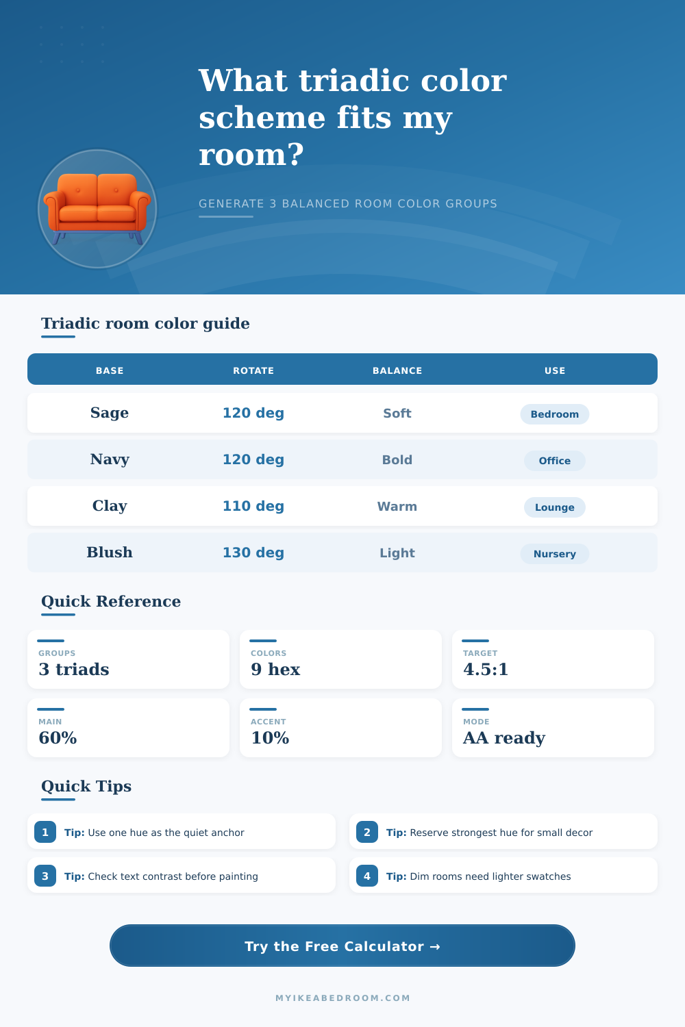
A triadic color scheme involve choosing three colors that is evenly spaced on a color wheel. Colors chosen for a triadic color scheme create the point of an equilateral triangle on a color wheel. Because the three color selected for a triadic color scheme are evenly spaced from each other, a triadic color scheme allow for high contrast between the three colors.
However, a triadic color scheme can lead to visual chaos if not manage correctly. If the colors are used in equal amount in a room, the triadic color scheme can lead to feelings of visual imbalance in that room. To avoid visual chaos in a room designed with a triadic color scheme, you must use specific ratio for each color.
How to use a triadic color scheme in a room
The most saturated color in the triadic color scheme should be used for the largest area in the room. The second most saturated color should be used for the medium colored items in the room. The least saturated color in the triadic color scheme should be used for small item in the room.
By using the triadic color scheme in these specific ratios, the color scheme will appear intentional rather then accidently designed. The brightness in a given room can change the way a triadic color scheme look in that space. In a room with very little natural light, you should lighten the colors chosen for a triadic color scheme to ensure the room doesnt appear dark.
In a room with alot of natural light, deeper, more muted color can be used for the triadic color scheme. The saturation of colors should also be considered when using a triadic color scheme in a room. High saturation level for the colors may create exhaustion in the area chosen for the color scheme.
Using less saturated color will create a more subtle color scheme. In addition to the saturation and brightness of colors chosen for a triadic color scheme, you should also consider the undertone of those colors. Undertones in a color are the subtle addition of warmth or coolness to that color.
If the undertones of the colors in the color scheme are warm, the color scheme may clash with warm undertones in the material in the room. For instance, warm colors may clash with coolly colored flooring. Thus, the undertones of the colors in the color scheme should match the undertones of the materials in the room.
For any signage or text designed with a triadic color scheme, the accessibility of the text should be considered. Accessibility of text ensure that the text is easy to read against the background color of the text. For instance, using white text on a pale yellow background may cause the text to be difficult to read.
The contrast ratio of colors in the triadic color scheme should be checked to ensure that they dont reduce the accessibility of text in that area. High contrast ratio will enhance the visual definition of the area. The tool provide on this page can be used to calculate the colors needed to create an effective triadic color scheme.
This tool will calculate the rotation of colors and the contrast ratio for the colors to be used in a triadic color scheme. This can save time that would of otherwise been spent manually mapping out a color wheel. The tool also allow users to experiment with a split triad color scheme.
Split triad color schemes involve two color that are closer together on the color wheel than the other colors. Split triad color schemes are useful in that they can create a more relaxed atmosphere in an area. By using this tool and by following the rules for saturation, brightness, and undertones in creating an effective triadic color scheme, humans can create a balanced and composed area in any space.