Analogous Color Palette Generator
Build a bedroom palette from neighboring hues around one base color, then tune spread, saturation, lightness, bias, contrast, brightness, and accent share before assigning each swatch to walls, built-ins, textiles, trim, and small decor.
| Spread | Palette feel | Best bedroom use | Watch point |
|---|---|---|---|
| 12-20 deg | Very quiet and nearly monochrome | Small rooms, rentals, calm sleep palettes | Needs texture so it does not look flat |
| 21-34 deg | Classic analogous harmony | Most bedroom walls, textiles, and storage | Check contrast between middle tones |
| 35-48 deg | Clear color movement | Feature walls, built-ins, guest rooms | Keep one hue dominant to avoid clutter |
| 49-60 deg | Expressive and editorial | Kids rooms, studios, creative corners | Use a lower accent ratio in bright rooms |
| Range | Result | Room brightness fit | Practical use |
|---|---|---|---|
| 18-54% | Moody, deep, wrapped | Bright daylight or strong lamps | Built-ins, headboard wall, reading nook |
| 28-68% | Balanced mid-tone palette | Average daylight bedrooms | Walls, wardrobe doors, bed frame zone |
| 40-82% | Soft, airy, layered | Dim rooms and north-facing rooms | Walls, bedding, curtains, nursery surfaces |
| 55-92% | Tint-focused and bright | Small rooms needing visual lift | Trim, shelves, linens, small storage |
| Share | Color role | Bedroom surfaces | Contrast note |
|---|---|---|---|
| 60% | Dominant base | Walls, wardrobe fronts, bedding foundation | Keep labels in black or white if needed |
| 30% | Neighbor support | Curtains, headboard, desk chair, rug field | Pair with the dominant color carefully |
| 10% | Accent hue | Pillows, art, handles, lamps, trays | Can be bolder because area is small |
| Trim | Neutral bridge | White, oak, birch, black, or metal details | Use it to reset the eye between hues |
| Ratio | Meaning | Use case | Bedroom example |
|---|---|---|---|
| 3:1 | Large text threshold | Big labels and display type | Large drawer category labels |
| 4.5:1 | AA normal text threshold | Most readable room labels | Desk labels, switch notes, tags |
| 7:1 | AAA normal text threshold | High comfort and low-vision use | Reading nook and work zone details |
| 10:1+ | Very high contrast | Strong signs or tiny labels | Closet bin stickers and schedules |
An analogous color schemes uses colors that are next to each other on color wheel. These colors shares a common primary color base. An analogous color scheme create a low-stress environment for the viewer because the colors is related to one another.
An analogous color scheme is used to prioritize the mood that the space create for the viewers. An analogous color scheme will create visual harmony within the space, such that no color compete with the others for the viewer’s attention. When using an analogous color scheme, it is important to manage the hue spread between the base color and the other colors in the color scheme.
How to Use Colors Next to Each Other in a Room
The hue spread is the mathematical distance between the base color and each of the other colors in the analogous color scheme. Using a hue spread that is too large will make the colors seem too far apart to create visual interest; however, using a hue spread that is too small may make the colors create a monotonous and blur effect within the room. A small hue spread will create a quiet environment within the room.
Using a wider hue spread will introduce movement into a potentially large room. Many people makes the mistake of using one favorite color in every surface of the room. Using only one color in every surface of the room may look visually pleasing to some, but it can create an oppressive atmosphere within the room.
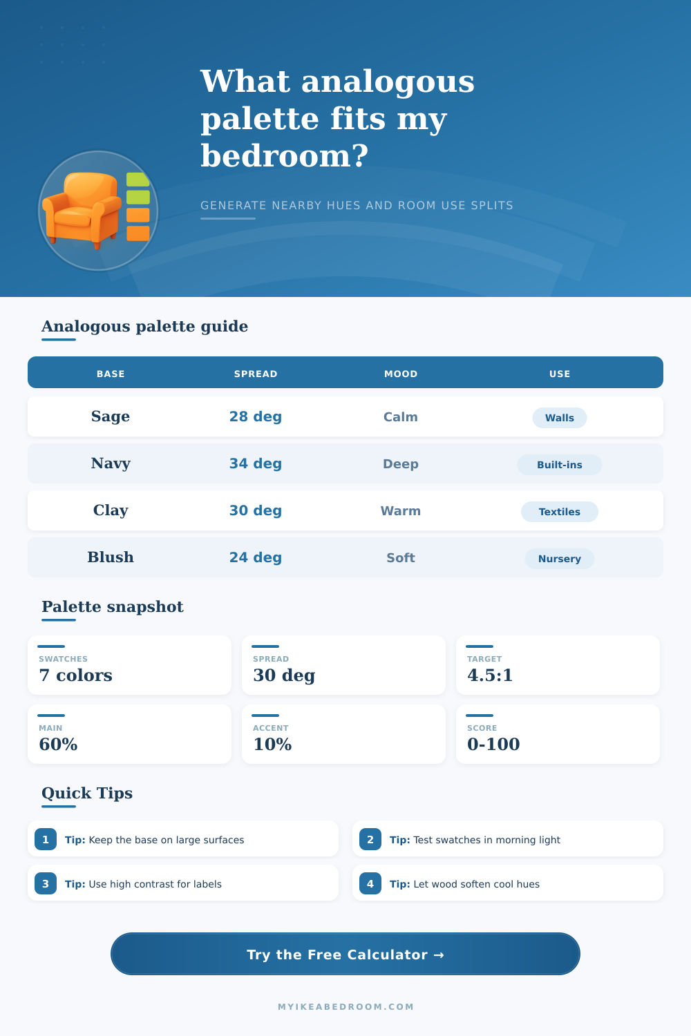
To even prevent the visual environment in the room from becoming oppressive, you can use the 60-30-10 rule. This rule states that the dominant color should be present in 60% of the space, the supporting color should be present in 30% of the space, and the accent color should be use in the remaining 10% of the space. For example, you can use the dominant color on the walls of the bedroom, you can use the supporting color on the curtains in the room, and the accent color can be applied to the pillows in the bed.
Lighting impact the colors that are used in a room. Therefore, when selecting colors for a room, you should consider lighting. If the room feature north-facing light, the color will be cool and blue in tone.
Using deep lightness ranges for colors in dimly lit rooms will create a moody atmosphere in the room. However, you should balance the colors with bright colors to ensure that the bedroom does not appear to be a cave. If the bedroom is very bright in the room, high saturation color can be used in the room since the brightness of the room will even out the colors.
Using a warm color bias or a cool color bias will change the temperature of the room. Using a warm bias will make the room feel more intimate and cozy for the individuals in the space. Using a cool bias will create the feeling of an airy and clear space.
Though these color biases are subtle in there color choices, they do affect the feelings that the individuals have within the space. Texture can be utilized in a color scheme to avoid boredom within the room. Since the analogous color scheme does not use colors of high contrast, different textured material should be used in the room.
Using a matte colored material for the walls of the room but using velvet pillows and a chunky knit blanket will provide visual interest in the space. Using various texture throughout the room will ensure that the space does not feel two-dimensionally. It is also important to consider the contrast in the functional items in the room.
While the analogous color scheme is suggested for use in bedrooms to aid in sleep, some contrast must be provided in functional item in the room. Using labels on the bins in a closet, for example, may necessitate the use of a high-contrast color so that the viewer can easily read the labels. Using a high-contrast color will prevent the analogous color scheme from appearing too saturated in the room.
Finally, ensure that the chosen colors are applied to the largest surfaces in the room first. The colors can always be changed on items like a pillowcase, for instance, but applying paint to a wardrobe is irreversible. Therefore, the colors should be applied to the largest surfaces first.
Additionally, the color swatches should be tested in the actual light of the room. Testing color swatches in the actual room ensures that the colors will visual appear as chosen by the designer.