🎨 Complementary Color Palette Generator
Enter any HEX color to instantly generate complementary, triadic, analogous & more harmonies with HEX, RGB, and HSL values
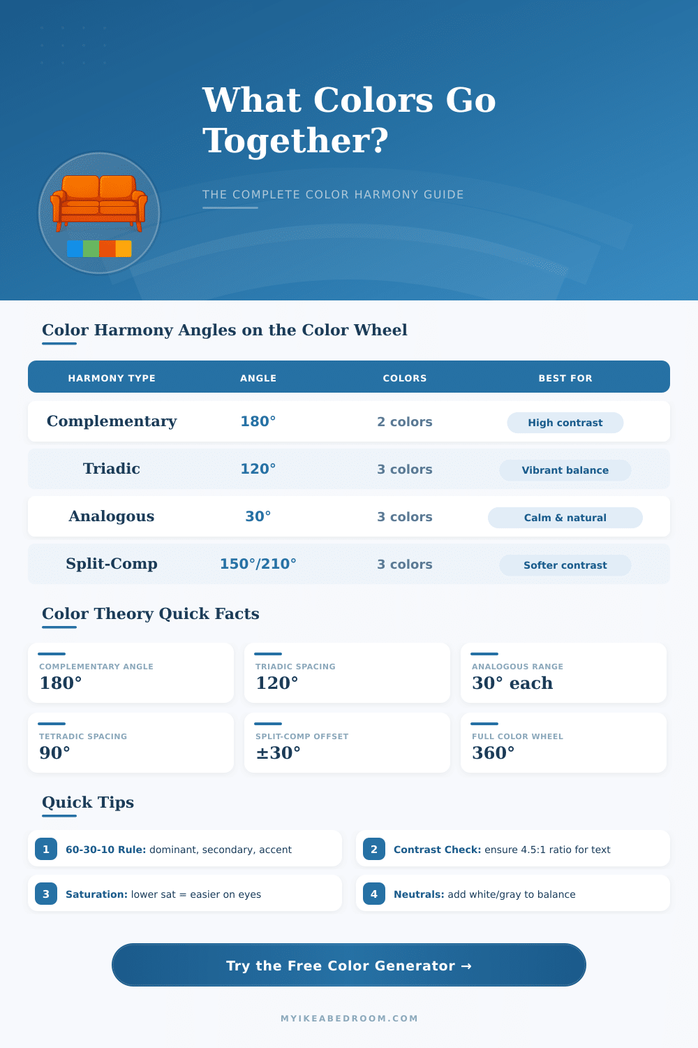
| Harmony Type | Wheel Angle(s) | Colors in Palette | Contrast Level | Best Use Case |
|---|---|---|---|---|
| Complementary | 180° | 2 | Very High | Call-to-action, branding, logos |
| Triadic | 120°, 240° | 3 | High | Vibrant, energetic designs |
| Analogous | ±30° | 3 | Low | Calm, natural, cohesive layouts |
| Split-Complementary | 150°, 210° | 3 | Medium-High | Balanced contrast, safer pick |
| Tetradic (Square) | 90°, 180°, 270° | 4 | High | Rich, complex palettes |
| Monochromatic | 0° (varies sat/light) | 3–6 | Low | Elegant, minimal, modern |
| Achromatic | N/A | Any | None | Neutral, professional, clean |
| Hue Range | Color Name | Complementary Hue | Comp. Color Name |
|---|---|---|---|
| 0° – 15° | Red | 180° – 195° | Cyan |
| 15° – 45° | Orange | 195° – 225° | Azure Blue |
| 45° – 70° | Yellow | 225° – 250° | Violet |
| 70° – 150° | Green | 250° – 330° | Magenta |
| 150° – 195° | Teal | 330° – 15° | Red-Pink |
| 195° – 255° | Blue | 15° – 75° | Orange-Yellow |
| 255° – 300° | Purple | 75° – 120° | Yellow-Green |
| 300° – 360° | Magenta-Pink | 120° – 180° | Lime-Green |
| Contrast Ratio | WCAG Level | Normal Text | Large Text | UI Components |
|---|---|---|---|---|
| Less than 3:1 | Fail | ❌ Fail | ❌ Fail | ❌ Fail |
| 3:1 – 4.5:1 | AA Large | ❌ Fail | ✅ Pass | ✅ Pass |
| 4.5:1 – 7:1 | AA | ✅ Pass | ✅ Pass | ✅ Pass |
| 7:1 or higher | AAA | ✅ Pass | ✅ Pass | ✅ Pass |
Color Palette form the basic part of what makes a website or app visually nice. They are made up of some main colors that involves, normally one main color that represents your brand, a helpful color (most commonly a more dark tone of the main) and one or two accent colors that adds contrast. The ideal commonly is three colors in whole: your main brand color some deeper for behind it and bright accent that ties everything to that basic feel.
A good Color Palette does not need to be hard. Coolors ranks between the fastest tools available, simply touch the spacebar and start, and you receive a whole new set of colors. Moreover, it allows you to browse between millions of already existing palettes, pull colors from photographs, control access and check, how colors genuinely look in real designs.
How to Pick a Good Color Palette
Canva entered this area with its own tool, that forms a Color Palette from an image in moments.
There is Figma, that stores more then thousand ready-made palettes, that you can change, swap and add directly in your drafts. Colour Hunt works otherwise, it picks and gathers palettes, that are specially fit for design and creative work. For something more community-based, KolorHex shared more than 177,000 user-created palettes, and they always add new ones with variations of already existing patterns.
Some resources go more deeply into the science of colors. There is a method, where you choose your main color and allow the tool to create helpful or contrasting colors by means of various models. Single tone sets, triads, tetrads, with or without complement.
Other options allow free experimenting. Some tools accept your own colors, that you put in, and make nice variations, that work more well together, staying near to your original idea. Some taps and downloads of samples, and you have something personally done.
Here is the main point however: RGB color models do not genuinely match with how our eyes and brain handle colors. There is no magic recipe, that makes any two colors universally pleasant for all. Other systems, like HSL or LAB, come more closely, but they are knot perfect.
In practice, sticking to a basic Color Palette helps that everything feels meant instead of scattered and messy. Use strong color moderate to create visual charm without overloading anything. Too many neutral colors?
Then spaces start to feel really weak and lifeless. A lively mix of colors brings sites alive. When you arrange the colors of your home carefully, every room can feel new and whole, and sorting by colors makes it simple to find items, that genuinely match.
Because of any link to nostalgia, choosing a Color Palette inspired by your favourite decade defines thewhole mood, think about dark browns and oranges for the 70s or soft pastels for other retro moods. Colors like dark blue and gold appear commonly in classic patterns, because they have lasting force through time.